联系佳味添成
 官方微信
官方微信 网站地图
网站地图
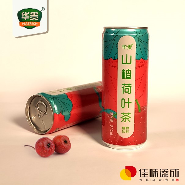
开发蓝靛果猕猴桃饮料产品,佳味添成如何选择适合的包装设计风格
在健康消费浪潮与“颜值经济”双重驱动下,植物基功能性饮料正迎来爆发式增长。蓝靛果(又称蓝靛果忍冬)与猕猴桃的组合,不仅在营养层面具备天然优势——前者富含花青素、多酚类物质,具有强抗氧化和抗炎潜力;后者则以高维C含量、膳食纤维和有机酸著称——更在风味上形成酸甜平衡、层次丰富的独特口感。然而,一款优秀的产品若缺乏与之匹配的包装设计,往往难以在货架上脱颖而出,甚至可能因视觉传达偏差而错失目标消费者。
佳味添成将从品牌定位、目标人群、功能属性、市场趋势及可持续理念五个维度,系统探讨蓝靛果猕猴桃饮料在包装设计风格上的策略选择,助力产品实现从“好喝”到“被看见、被信任、被选择”的跨越。
Jiawei Tiancheng will systematically explore the strategic choices of packaging design styles for indigo kiwi fruit beverages from five dimensions: brand positioning, target audience, functional attributes, market trends, and sustainable concepts, to help the product achieve a leap from "delicious" to "seen, trusted, and chosen".
一、明确品牌定位:包装是无声的品牌宣言
1、 Clear brand positioning: Packaging is a silent brand statement
包装不仅是容器,更是品牌价值观的第一触点。蓝靛果猕猴桃饮料的包装风格必须与其核心定位高度一致:
Packaging is not only a container, but also the first touchpoint of brand values. The packaging style of indigo kiwi fruit beverage must be highly consistent with its core positioning:若定位为高端功能性饮品(如主打抗氧化、免疫力支持),应采用极简主义、低饱和度配色(如深紫+墨绿+米白)、磨砂材质或玻璃瓶,传递“纯净、专业、高效”的形象;
If positioned as a high-end functional beverage (such as focusing on antioxidant and immune support), minimalism, low saturation color schemes (such as deep purple+dark green+beige), frosted materials or glass bottles should be used to convey the image of "purity, professionalism, and efficiency";若定位为年轻化潮流饮品,可大胆运用撞色(如亮紫+荧光绿)、手绘插画、动态渐变等元素,强调“活力、新奇、社交属性”;
If positioned as a trendy beverage for the younger generation, bold use of contrasting colors (such as bright purple+fluorescent green), hand drawn illustrations, dynamic gradients, and other elements can be employed to emphasize "vitality, novelty, and social attributes";若强调地域特色或生态溯源(如产自东北小兴安岭的野生蓝靛果),则可融入自然肌理、手写体字体、森林/浆果插图,打造“原生、野趣、可信赖”的田园美学。
If regional characteristics or ecological origins are emphasized (such as wild indigo fruits produced in the Xiaoxing'an Mountains of Northeast China), natural textures, handwritten fonts, forest/berry illustrations can be integrated to create a "native, wild, and trustworthy" pastoral aesthetic.
关键在于:包装风格必须服务于品牌故事,而非盲目追随流行。例如,农夫山泉“打奶茶”系列成功的关键之一,正是其复古插画与“童年回忆”情感联结的高度统一。
The key is that packaging style must serve the brand story, rather than blindly following trends. For example, one of the key factors for the success of Nongfu Spring's "Milk Tea" series is the highly unified emotional connection between its retro illustrations and "childhood memories".
二、洞察目标人群:让设计“说他们的话”
2、 Insight into target audience: Let design 'speak their words'
不同消费群体对包装的审美偏好与信息敏感度差异显著:
There are significant differences in aesthetic preferences and information sensitivity of packaging among different consumer groups1. Z世代(18–25岁)
Generation Z (18-25 years old)追求个性表达与社交分享价值。偏好高辨识度、Instagrammable的设计。建议采用:
Pursuing personal expression and social sharing value. Prefer designs that are highly recognizable and Instagrammable. Suggested use:荧光色块、不规则排版、趣味标语(如“抗氧化?我超会!”);
Fluorescent color blocks, irregular layout, and fun slogans (such as "Antioxidant? I'm amazing!");瓶型创新(如异形瓶、可重复密封小罐);
Bottle type innovation (such as shaped bottles, reusable sealed small cans);二维码链接AR互动或成分溯源故事。
QR code links to AR interactive or ingredient traceability stories.2. 新中产健康家庭(30–45岁)
2. New middle-class healthy families (aged 30-45)关注成分安全、功效真实与儿童友好性。倾向:
Pay attention to ingredient safety, authentic efficacy, and child friendliness. Tendency:清晰的成分列表、无添加标识;
Clear ingredient list without added labeling;柔和自然色调(避免过度鲜艳);
Soft and natural color tones (avoid overly bright colors);家庭装大容量+便携小瓶组合;
Family sized large capacity+portable small bottle combination;包装背面附有营养师推荐语或饮用场景建议(如“早餐搭配”“运动后补充”)。
The back of the packaging comes with nutritionist recommendations or drinking scenario suggestions (such as "breakfast pairing" or "post exercise supplementation").3. 高端礼品市场
3. High end gift market注重仪式感与文化内涵。可考虑:
Emphasize the sense of ceremony and cultural connotation. Consider:礼盒装设计,内衬环保棉纸;
Gift box design, lined with environmentally friendly cotton paper;采用烫金、压纹、丝带等工艺细节;
Using process details such as hot stamping, embossing, and ribbons;融入东方美学元素(如水墨晕染表现浆果汁液流动),但需避免过度繁复。
Incorporating Eastern aesthetic elements (such as ink wash blending to depict the flow of pulp and juice), but avoiding excessive complexity.
三、突出产品功能属性:视觉即功效暗示
3、 Highlighting product functional attributes: Visual as functional suggestion
蓝靛果猕猴桃饮料的核心卖点在于“双果协同抗氧化”与“天然维C爆表”。包装设计应通过视觉语言强化这一认知:
The core selling points of indigo kiwi fruit beverage are "dual fruit synergistic antioxidant" and "natural vitamin C explosion". Packaging design should reinforce this cognition through visual language:色彩心理学应用:
Application of Color Psychology:蓝靛果的深紫色象征花青素与抗氧化力,猕猴桃的鲜绿色代表维C与清新。主色调可采用“紫绿渐变”或“分区块对比”,直观传递双果融合概念。避免使用橙色或红色,以免误导为橙汁或草莓味。
The deep purple color of indigo fruit symbolizes anthocyanins and antioxidant power, while the fresh green color of kiwifruit represents vitamin C and freshness. The main color tone can adopt a "purple green gradient" or "segmented block contrast" to visually convey the concept of dual fruit fusion. Avoid using orange or red to avoid misleading orange juice or strawberry flavor.图形符号化:
Graphic symbolization:可设计抽象化的浆果轮廓、分子结构图(如花青素C27H31O16)、盾牌图标(象征免疫防护)等,以现代插画形式呈现,既专业又不失美感。
Abstract berry outlines, molecular structure diagrams (such as anthocyanin C27H31O16), shield icons (symbolizing immune protection), etc. can be designed and presented in modern illustration form, which is both professional and aesthetically pleasing.透明窗口或半透明材质:
Transparent window or semi transparent material:若产品色泽诱人(呈宝石紫或琥珀绿),可采用局部透明PET瓶或磨砂透光设计,让消费者“看得见真实”,增强天然信任感。
If the product has an attractive color (gemstone purple or amber green), partially transparent PET bottles or frosted translucent designs can be used to allow consumers to "see the truth" and enhance natural trust.
四、顺应市场趋势:从“好看”到“有意义”
4、 Adapting to market trends: from 'good-looking' to 'meaningful'
当前饮料包装设计正经历三大趋势转变,蓝靛果猕猴桃产品应顺势而为:
The current beverage packaging design is undergoing three major trend changes, and indigo fruit kiwi products should follow the trend:1. 极简 vs. 复古:找到中间态
1. Minimalist vs. Retro: Find the Middle Way虽然“Clean Label”(清洁标签)风靡全球,但完全空白的包装易显冷漠。建议在留白基础上,加入一枚精致手绘浆果或一句微文案(如“来自北纬48°的抗氧化力量”),实现简约而不简单。
Although "Clean Label" is popular worldwide, completely blank packaging can easily appear indifferent. Suggest adding a delicate hand drawn berry or a micro caption (such as' antioxidant power from 48 ° N latitude ') on top of the blank space to achieve simplicity and not simplicity.2. 功能可视化
2. Function visualization消费者越来越反感“伪健康”营销。包装上可标注具体数据,如“每瓶含120mg维C(≈2个猕猴桃)”“花青素含量≥80mg”,用数字建立可信度。
Consumers are increasingly averse to "pseudo health" marketing. Specific data can be labeled on the packaging, such as "Each bottle contains 120mg vitamin C (≈ 2 kiwifruit)" and "Anthocyanin content ≥ 80mg", to establish credibility with numbers.3. 情绪价值注入
3. Emotional value injection后疫情时代,消费者渴望愉悦与治愈。可通过柔和曲线、圆润瓶身、温暖插画(如阳光下的浆果丛)传递“轻疗愈”情绪,让产品成为日常中的小确幸。
In the post pandemic era, consumers crave pleasure and healing. By using soft curves, rounded bottle bodies, and warm illustrations (such as berry clusters in the sunlight), the "light healing" emotion can be conveyed, making the product a small blessing in daily life.
五、践行可持续理念:环保即竞争力
5、 Practicing the concept of sustainability: environmental protection is competitiveness
据尼尔森调研,超70%中国消费者愿为环保包装支付溢价。蓝靛果作为野生浆果,天然带有“生态友好”基因,包装设计应强化这一优势:
According to Nielsen research, over 70% of Chinese consumers are willing to pay a premium for eco-friendly packaging. As a wild berry, indigo naturally carries the "eco-friendly" gene, and packaging design should strengthen this advantage:材料选择:优先使用rPET(再生聚酯)、甘蔗基生物塑料、铝瓶(可100%回收);
Material selection: Prioritize the use of rPET (recycled polyester), sugarcane based bioplastics, and aluminum bottles (100% recyclable);减量化设计:去除过度外盒,采用一体成型标签;
Reduction design: Remove excessive outer boxes and use integrated labels;可重复利用性:设计成可作花瓶、笔筒的玻璃瓶,延长包装生命周期;
Reusability: Designed as a glass bottle that can be used as a vase or pen holder, extending the packaging life cycle;环保认证标识:清晰标注FSC、碳足迹、可回收标志,提升品牌责任感形象。
Environmental certification logo: Clearly label FSC, carbon footprint, and recyclable logo to enhance brand responsibility and image.
值得注意的是,环保不等于“土味”。Patagonia、Oatly等品牌已证明:可持续设计完全可以兼具高级感与时尚度。
It is worth noting that environmental protection is not equal to "unfashionable". Patagonia, Oatly and other brands have proven that sustainable design can perfectly combine luxury and fashion.
结语:包装,是产品与世界的第一次对话
Conclusion: Packaging is the first dialogue between products and the world
蓝靛果猕猴桃饮料的包装设计,绝非简单的“贴个标签、选个颜色”,而是一场融合品牌战略、用户心理、功能传达与社会责任的系统工程。在信息过载的零售环境中,消费者平均仅用3秒决定是否拿起一款新品——这3秒,由包装说了算。